


I promised….
I said in 2020, when I first came up with this project, that I would do more of them. But I didn’t. I made excuses about not having enough time, being busy with photography and making YouTube videos, but the reality is that all the hard work is done at this point.


Editing fine art images
Creating fine art images is time consuming. You have the initial preparation, travel - more than likely not getting the right lighting conditions the first time you visit a location; and that is before you even get onto the editing. The workflow to editing fine art images, which I have created an in depth review of in this link here, is quite intense and is not for everyone. It takes a lot of practice, and perseverance to hone the craft of architectural fine art photography - but when you do get the results that you are hoping for, it is a great feeling.


What’s the Vecors project?
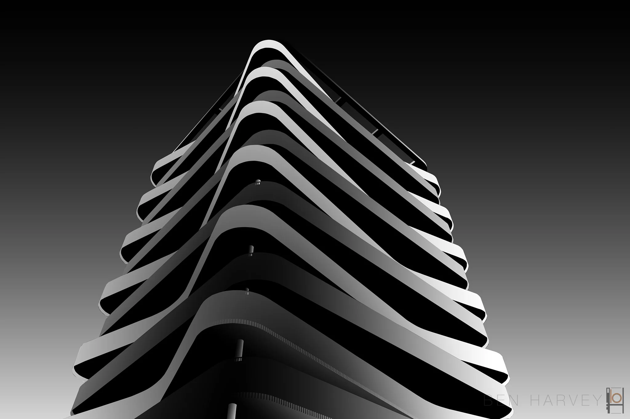
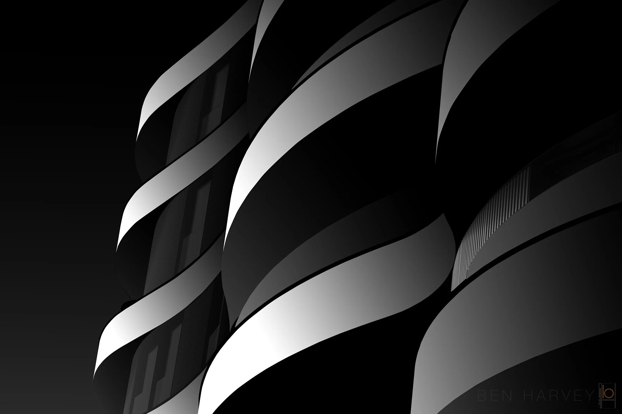
As an Architect, I am instinctively drawn to graphical images. That includes graphical buildings, with dynamic lines and strong perspectives. I believe that this helps create an interesting fine art image, and this gives me more creative freedom. Whenever I have attempted to edit a more traditional building, a castle for example, I struggle to sculpt the light in an interesting manner. I am not always trying to create a realistic interpretation of how light will fall on a building, sometimes I am completely making up patterns of light that could never exist; but I follow some general principles so that when you look at the image; hopefully your brain says, “that works“.


How do you create these images?
Luckily I have you covered here, as I have made a video about the editing process, which shows you the very simple way of repurposing your existing photoshop files, to create similar vector images. The amazing part is that when you look at these vector images, which in some instances contain absolutely no pixels that were captured with a camera, your brain still sees the image of the building itself. The reality is though, all you are looking at its gradients created in photoshop, utilising the selections that I painstakingly created to create the fine art images.


Which buildings work well for vector images?
Following on from what I said above, strong graphical buildings with features work well. Contrasting metal on dark glass, cantilevers, framed elements, large text, curving elevations. All of these elements on a building work well in a drawing, and therefore translate well to becoming a vector image. I tend to blend in a subtle layer of colour from the sky or texture from something in the original image, where I feel it is needed, but only where necessary.


Give it a go!
If you have a try at creating vector images from your fine art photoshop files, let me know. Share them with me, tag me on social media and let’s see how the project can evolve!
